How Do I Use the Tab Control on Android and iOS Devices? (Magic xpa 2.x)
Since Magic xpa 2.5, the Tab control appears as a tab bar on Android and iOS devices.
|
The tab bar appears in full screen, so when you're developing an app for Android or iOS, you should stretch the Tab control across the entire form.
| |

|
In general, the tab bar uses the functionality defined by default in the device. This table here gives you the details about the functionality for each of the devices.
|
Functionality
|
Android
|
iOS
|
|
Navigation
|
Click the tab bar items or swipe the tab bar.
|
Click the tab bar items.
|
|
Location
|
At the top of the form.
|
At the bottom of the form.
|
|
Horizontal scrolling inside a tab
|
Not supported. Horizontal scrolling navigates between tabs. Controls (on a tab) that exceed the screen size will not be seen.
|
Supported.
|
|
Vertical scrolling inside a tab
|
Supported.
|
Supported.
|
|
Title bar
|
Mandatory. The Tab control is an integrated part of the title bar, so if the form is defined with a Tab control, then the title bar will be shown (even if the Title Bar property is set to No).
Note: In some Android operating system versions, when in Landscape mode, the tabs are seen in the title bar area.
|
Not mandatory.
The tabs are always displayed at the bottom.
|
Images

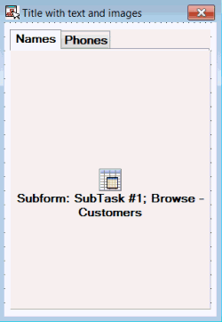
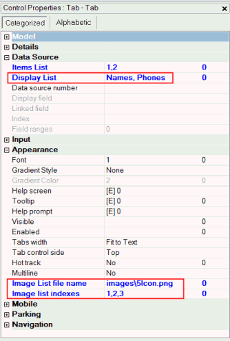
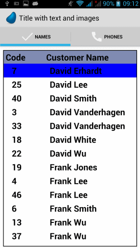
You can put both text and images in the tab. The images are defined in the Image List File Name and Image List Indexes properties, just like in desktop tabs. But, there are a few differences. Unlike desktop tabs:
-
The images' size is not limited to 16x16. The images, however, have to be rectangles. So, for example, the image list can contain multiple 100x100 images.
-
The image file has to contain images for all of the tabs.
Here is an example of what your tabs will look like when you set up the tabs to have both text and images.

Android only
For Android devices, you can hide the tab header by having blank text and no images. In this case, the tab will be used for scrolling between objects without a header. You can display and/or hide the text and images by setting the Display List property and the Image List File name property. You can use this table to figure out what properties to set for different combinations of text and images.
|
Display combination
|
Display List property
|
Image List File name property
|
|
To show only text values
|

|
X
|
|
To show text + images
|

|

|
|
To show only images
|
X
|

|
|
To hide the tab bar (and have only pane scrolling behavior)
|
X
|
X
|
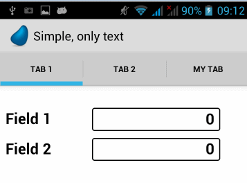
Here is an example of what your tabs will look like when you set up the tabs to show only text.

Exceptions
Some scenarios are not allowed because of the default behavior of the devices. You can't have the following:
-
Controls placed outside the Tab control.
-
Controls attached to layer 0 of the Tab control.
-
More than one Tab control on the form.
-
A Tab control attached to a container control (such as a Group control or another Tab control).
-
A subform task that has a Tab control.
Note: The background of the form (wallpaper, color, and gradient) will be used for all of the tabs.
Since version: 2.5
The Rich Client Samples projects (program RMO04)
For desktop applications: How Do I Associate Images to Different Tabs in a Tab Control?

