Data Mapper Screen – Color Coding and Display (Magic xpi 4.5)
The Data Mapper screen uses various colors and indications to give you a visual representation of the mapping that you have performed, as shown in the following image.
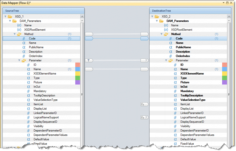
The type of the lines that connect the nodes vary according to the type of connection that is made:
-
 Indicates a compound node connection. Compound nodes are connected with a double white line.
-
 Indicates a simple node connection.
-
 Indicates a selected line.
-
 Indicates that you are hovering over a specific connection line.
In addition, the Data Mapper shows mandatory Destination fields in bold.
The following icons denote a node's status:
-
 Single Instance Filter at Source compound node.
-
 Condition at Destination node.
-
 Calculated Value at Destination node.
-
 Condition + Calculated Value at Destination node.
-
Multi Update at Destination node.
-
Multi Update + Condition at Destination node.
To further enhance a node's visual clarity, you can mark a node with one of the following background colors by right-clicking on the required node and selecting Color from the context menu:
These color settings can only be saved for a specific instance. The colored nodes are retained when you copy and paste the step, and when you copy a flow and a business process.
|
Note:
|
You can easily check which Sources are connected to which Destinations, and vice versa, by parking on a specific Source or Destination. If you park on a Source, all Destinations connected to this Source, and the connections themselves, are highlighted. If you park on a Destination, all connected Sources and their connections are highlighted in the same way. Alternatively, you can click on a specific connection. The Sources and Destinations linked by this connection are then highlighted.
|
